Showing posts with label Photoshop. Show all posts

Saturday, June 4, 2011

Microscopists by day- Illustrators by night

UPDATE: 2013 - Robotslayer Paperback and iOS app have since become available!

Interview with fellow microscopist/illustrator, Vince Kamp

I begin with a call-out to the world-renowned microscope stage developers: Linkam Scientific.  Many industries require the ability to accurately perturb material or biological specimens with temperature, shear, tensile stress, exposure to radiation, humidity, etc.; and the Linkam crew enables viewing of microstructure via optical microscopy and many spectroscopic methods while doing so.  Rheologists and biologists alike adore their fine craftsmanship.  Linkam's products are available in the U.S. from many dealers including the McCrone Research Center (Walter McCrone was a famous "chemical microscopist" responsible for analyzing the pigments within the Shroud of Turin). Check out the Linkam online TV channel for more: 
LinkamTV
Turns out, although I have been interacting with Linkam since the late 90's, I did not know until recently that Operations Director Vince Kamp has been churning away on his own illustrated children's book. I was delighted to learn that he has a similar workflow: (1) sketch by hand onto paper, (2) scan, (3) color/texturize digitally.  His style is natural; it looks naturally painted with oil paints. So here goes my informal interview with him:


SEL: Vince, how do you construct your paintings? 
VK: As far as my process is concerned, well I sketch everything in pencil and then scan and import into PS.  I block in background colour and then block in my characters, I work from dark to light and use only one brush, a sort of splatter brush that mimics a traditional brush, set to 90% opacity and use pressure sensitivity on my tablet (wacom cintiq, 12") [SEL: Cripes!  I want one of those!].  I have messed around with water based colouring pencils and oil pastels but not for my online stuff.

Side bar:  This mixed media approach of (1) sketching, (2) scaning, (3) digitally coloring is getting popular. 
So here goes another call out to the friendly Brits.  They have an entire professional magazine dedicated to like artists; and it's rooted in fnatasy and sci-fi art.  Check out the ImagineFX website (their magazines are distributed in Barnes & Noble too).
ImagineFX Tutorial

SEL: You are too humble for words, and your sarcasm is thick...but delivery dry (especially via email).  Please clarify how you get your digital colors to look like real paint.
VK: I'm heavily influenced by traditional painting techniques and though I'm completely untrained and don't know what I'm doing [SEL: UK humor?], the books I study almost exclusively focus on light and colour in oil painting.  So I guess I'm saying my pics may not look so digital because I try to paint in a traditional way of using layers of paint and blending.  I almost never use all the various tweaking filters in PS as I would love to one day have the time to paint properly on canvas. I don't want to rely on digital tools to get the look I want.  If I ever get round to being able to create a beautiful oil painting I think I would feel like I could really exploit everything in PS to produce much better pictures, but I would like to earn that right by studying all the fundamentals first.  Understanding colour and light is just so fascinating and I don't believe I've even scratched the surface, it's insanely frustrating.

SEL: Your style is perfect for a kid's book, I can't wait to see how Leo the Robot Slayer emerges.  Does any work inspire this style? 
VK: Even though my pics are all cartooney I love Vermeer and Rembrandt and many of the more obscure post renaissance painters from in and around my Dad's village in Holland.  I know I'm waffling but I thought I would give you an idea of how I think when I'm colouring my pics as the process itself is really very simple.  One brush, 90% opacity.  If you haven't already, check out James Gurney's light and color http://www.amazon.co.uk/Color-Light-Guide-Realist-Painter/dp/0740797719. By the way, the comment that my pictures don't look digital is probably the greatest compliment I have received so far, as that is ultimately what I'm desperately trying to achieve.


Friday, May 6, 2011

Images Have Skeletons Too

 Scientific Image Analysis 
can be a great tool to learn about composition
Key Points:
  1. Images have real backbones ("structure" or "composition")
  2. Viewers eyes gravitate toward edge detection; as an artisit, you must use composition to lead your viewer through your landscape
  3. It is fun, although excessive, to reveal composition with scientific algorithms.

Art Analysis

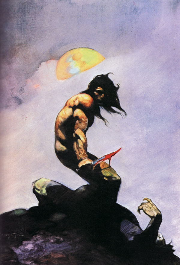
Frazetta's Tanar
An inspirational side bar: I stumbled across a cool blog @ Ideas Made of Light that dissects the composition of fantasy art (and others), including Frazetta's "Tanar of Pellucidar", M.C. Escher's "Relativity", and Dali's "Gala Contemplating...Abraham Lincoln".

This is a fantastic website for lovers of Art & Science, since it comprehensively reveals compositional design concepts with easy-to-understand visuals.  If you want to understand art better, or be a more deliberate designer, check these case studies out ... then apply what you learn.


Russ's Image Analysis Book
Image Analysis

I am a huge fan of John Russ, a retired North Carolina State Professor and image analysis/metallurgist expert.  The analysis methods he often applied to solid state matter are also used to quantify microstructures within soft matter mixtures (i.e. paints and consumer products like cosmetics, toothpaste, and conditioners :) ).  His Image Analysis Processing handbook-6th edition is just being released.  Image Analysis can also be used to analyze Sword & Sorcery cover art to reveal compositional design!  Woo-hoo! 


Shape Analysis of Positive / Negative Space

Let's apply some John Russ's image analysis (employable via the Photoshop interface as "filters") to reveal the composition within the proposed my Lords of Dyscrasia cover art.  I shared a draft of this entry to John and his son Chris (who leads Reindeer Graphics and collaborates with his father authoring books and code), and they rightly clarify that, in artistic terms, the below procedure "is a shape analysis of positive or negative space."

Here is what we'll get:

(1) a skeleton of features within the primary focus, the "Intensity Skeleton"
and (2) a demarcation of the primary "Contrast Interfaces" that lead the viewer's eyes about the image


To do this, we'll apply a series of operations to our color image.
1) First, we'll isolate the intensity levels by transforming the RGB (red, green, blue) image into HSI (hue, saturation, intensity) map; we'll disregard the hue and saturation for this work and focus on the intensity.
2) Next, we'll apply a median filter to remove the high frequency details since we aim to look at the gross composition (a Gaussian blur).
3) Thirdly, we'll transform the grayscale image (256 gray levels) into a binary image (2 levels, black and white) by common thresholding (we choose a critical gray level that turns all lower to black and all higher to white).
4) Finally, we'll fill-in-holes via a morphology filter.
This prework enables us to derive our skeletons. To mark out the features within the primary focus (figures and fire), we...
5) Recolor our binarized image with a Euclidean Distance Map.  This will re-shade all black regions with a new intensity dependent on the proximity to the white area. This effectively will make a landscape in which the peaks (the skeleton) can be isolated
6) To isolate the backbones, we threshold our distance map and select values that contain only the peaks.
7) To visualize the backbone of this internal structure within the focus area, we overlay the skeleton atop a version of the original.


Okay, we are also interested in contrast (contrast mechanisms differentiate the many imaging modes used in microscopy). In common terms we are looking for the edges, or interfaces, between key regions.   
5b) We'll still need our distance map.  We'll go back to image 4 and take a different path. 
6b) This time we'll isolate the edges by thresholding and coloring the opposite peaks (in this case the lightest shades of grey).
7b) We'll overlay them atop a version of the original
8b) And compare these heavy-duty mathematically derived drawings to a simple free-hand estimate (an ellipse).

Hopefully this supports the design I worked in up-front.   The idea was to draw the viewer's eye toward the skeletal hero (the undead, anti-hero Endenken Lysis).


Saturday, January 22, 2011

Xmas Card 2010 Bits

Making Holiday Cards has become an evolving tradition. 
The sequence of cards are on: http://lindbergcrafts.blogspot.com/


The composition is in tribute Frank Frazetta's Silver Warrior cover art (Frazetta was a legendary fantasy who passed away this year- 2010; Heidi insisted I remove the sword from Santa's hand...actually she talked me down from doing a "Gift Dealer" rendition of Santa riding Rudolf that mirrored Frazetta's Death Dealer --actually, "Father Christmas" has a history of riding Yule Goats in Scandinavia folktales, so this might be okay for next year's theme).

I thought I should share a little of my workflow:

Frank Frazetta's Silver Warrior painting inspired the composition(Frank passed away in 2010)
 

Initial Sketch of Santa (without sword)
Photoshop Screenshot revealing excessive layering and masking

My Final 2010 Cover