Showing posts with label Frazetta. Show all posts

Thursday, August 29, 2013

Ken Kelly - Seasons Greetings

I commissioned Ken Kelly to make the cover art for the sequel to Lords of Dyscrasia, and the painting is due shortly. When the cover art is completed, I will share a blog post chronicling the design.Expect more updates on the sequel soon. The target publishing date is early 2014.

Ken Kelly is a famous fantasy artist who studied under the legendary Frank Frazetta.  Kelly has become a legend himself; browse his oil painting gallery and you will recognize the Horseclan covers, tons of Conan covers, etc.

Of course I have a hobby creating Season Greeting cards (link to S.E.'s card gallery), sometimes with a dark twist...and sometimes with an aim to mimic Frazetta (see 2010 card), but I never approached the darkness Ken Kelly presented so well in "Seasons Greetings".  I have already started this year's card (yes, I know it is only August, but my Fall schedule is busy).  No worries...my card will not be this dark.
  
Season's Greeting - Ken Kelly

Thursday, May 17, 2012

ImagineFX - Frazetta Tutorials and Workshops

As discussed previously (Weird, Dark Art Design: Implicit vs. Explicit Gore and Horror renowned fantasy artist Frank Frazetta was a master at creating vivid, emotive works noted for beautiful depictions of human anatomy, typically with limited subjects centered in the image (for more on composition, I recommend reading Scott McDaniel's dissection of Frazetta's "Tanar of Pellucidar"). This post consolidates some of ImagineFX 's tutorials/movies honoring his style. 

ImagineFX is the premiere digital magazine for today's artists.  It takes a holistic approach toward creating art.  I was particularly attracted to its emphasis on combining traditional drawing/inking approaches with digital rendering (coloring).  ImagineFX is available by PDF and hardcopy magazine; they are known for providing digital content (images, textures, Photoshop brushes) on a DVD including videos of the artists creating their work (now being posted on their YouTube Channel).  The videos are not replacements for the magazine write-ups, and often do not have audio.  However, watching the enhanced time-lapse process in "real-time" is insightful for those learning how to compose a classic fantasy scene.  

Jean-Sébastien RossbachFrank Frazetta style


Saturday, July 23, 2011

Weird, Dark Art Design: Implicit vs. Explicit Gore and Horror

Note this is Part of a series:


#4) Weird, Dark Art Design: Implicit vs. Explicit Gore and Horror (you are here) 
____________________
Frazetta's "Warrior with Ball and Chain" --Where is the Gore?


Weird artists have consistently felt misunderstood by the masses, and readily defended their interests as healthy, without evil intent. Just decades ago, renowned fantasy cover artist Frank Frazetta combated the apparent immaturity associated with his art, as he is quoted in his retrospective book Icon:
"They're positive my art my work is bloody and terrible, and I say 'oh Yeah? Find it!' And they can't.  There's merely the suggestion of it, a little splash of red on a sword, a spot in the snow, and that's it.  I don't paint heads rolling around, or severed limbs... In spite of the subject or violence, I want every painting to be a thing of beauty."  (i)
"Sometimes I wonder what people really see when they look at my art.  I mean, I know I exaggerate my figures for effect, make them in ways they may not normally move, push things a little to heighten the excitement.  And I can get away with the exaggeration and still make you believe in the reality of the scenes because I know how to draw.  I know my anatomy.  I know how real people and real animals move.  But these guys who are trying to 'do' me, boy!  Arms and legs the size of trees; blood and guts everywhere, that's not what I do.  My figures are muscular, but for chrissake, they're not ridiculous. And despite the violence in my art I want people to look at it and say, 'It's beautiful!' and forget about the situation.  I want them to look at it for the sheer beauty and symmetry and the wonderful shapes and color and rhythm, and that's all they will see.   They don't think about the fact it's a battle scene.  It's taste that separates the men from the boys..." (ii)
Frazetta posed that a portion who admired and attempted to imitate his work did not understand why his designs were effective.

Offer an experience, not a photograph 
The effect of horror is best gained when the sensation is most intangible. To put the horror in visible shape, no matter how gibbous or mistily, is to lessen the effect. I paint an ordinary tumble-down farmhouse with the hint of a ghastly face at a window; but this house-this house-needs no such mummery or charlatanry; it exudes an aura of abnormality-that is, to a man sensitive to such impression. (iii)
So wrote R.E. Howard who funneled his views of weird art though his characters, as in the above quote from The House in the Oaks (a story posthumously finished by August Derleth).

Conveying aesthetic events is a key success criteria expressed by many weird artists.  Dark fantastical art serves as an experiential map that appeals to the futile hopes of readers who, mindful of the terror but driven by conviction, want to understand the human spirit. Those who think dark art is scary and evil or necessarily gory, those who reprehend it, are merely ignorant. Perhaps those called by dark muses care to endure the terrific process of speculating, researching, and mediating the unknown by reading and writing. Those not willing to experience weird art, but are willing to critic or trivialize it, may just be terrified to explore the human spirit.

Today's mass market genres of fantasy and horror fiction arguably grew from a single 'weird' source nearly a hundred years ago during the depression era; pulp magazines were emerging as a new mass medium, and short stories by authors like H.P. Lovecraft, Clark Ashton Smith, and Robert Ervin Howard carved new boundaries around the realm of fiction. What might interest unfamiliar with weird fiction are the motivations that lured many readers: a desire for answers and the fear of discovering them. Mass market horror and fantasy genres that later evolved from weird fiction are no longer defined by this, for the genres have grown into new territories and audiences that include markets for children, young adults, and consumers insistent on purchasing trilogies. Clark Ashton Smith, weird author, artist, and contemporary of Lovecraft and Howard captured the beauty of the weird tale:
Mr. Lovecraft has stated very lucidly and succinctly the essential value and validity of the horror story as literary art, and there is no need to recapitulate his conclusions. It has often occurred to me that the interest in tales of horror and weirdness is a manifestation of the adventure impulse so thoroughly curbed in most of us by physical circumstances. In particular, it evinces a desire-perhaps a deep-lying spiritual need-to transcend the common limitations of time, space, and matter. It might be argued that this craving is not, as many shallow modernists suppose, a desire to escape from reality, but an impulse to penetrate the verities which lie beneath the surface of things; to grapple with, and to dominate, the awful mysteries of mortal existence. The attitude of those who would reprehend a liking for horror and eeriness and would dismiss it as morbid and unhealthy, is simply ludicrous. The true morbidity, the true unhealthiness, lies on the other side. (iv)
References
  • i Frazetta, F., Ed. (1998). ICON: A Retrospective. Grass Valley, C.A., Underwood Books. p98
  • iii Frazetta, F., Ed. (1998). ICON: A Retrospective. Grass Valley, C.A., Underwood Books. p158
  • iii Howard, R. E. (2001). The House In The Oaks, Nameless Cults. Oakland, CA, Chaosium Publications. P168.
  • iv Machen, A. (1973). Planets and Dimensions: Collected Essays of Clark Ashton Smith, Mirage Press

Friday, July 1, 2011

Unassuming Ohio Has Legitimate Sword and Sorcery Roots

See here! Ohio has Authors, Musicians, Illustrators, & Metal-Smiths!

Authors
Swordsmen and Sorcerers' Guild of America (SAGA, 1960-80s) was a group of authors that sparked a revival/growth of the Sword and Sorcery genre--represented by a series of anthologies called Flashing Swords (graced with covers from Frazetta and edited by Lin Carter).   Frazetta’s covers are known for revitalizing the genre. Carter had his own passion to evolve Sword & Sorcery (with L. Sprague de Camp, Carter posthumously “co-authored” several Conan tales in the 1960’s for the Lancer editions that published “all” the Conan tales in chronological order).  By design, each story for Flashing Swords was newly crafted; the idea being to generate and accumulate a new foundation for Sword & Sorcery
So what was the scope of the books? Carter nicely defines Sword and Sorcery in his introduction:
We call a story Sword & Sorcery when it is an action tale, derived from the traditions of the pulp magazine adventure story, set in a land or age or world of the author’s invention—a milieu in which magic actually works and the gods are real—and a story, moreover, which pits a stalwart warrior in direct conflict with the forces of supernatural evil (Lin Carter, Flashing Swords I, 1973)
Sword and Sorcery was coined by Fritz Leiber (Chicago, IL)….though the genre was started by Robert Howard (Cross Plains, TX)…and Frank Frazetta hails from PA.  Could OH actually have any roots?  Turns out, 3 of the 15 SAGA members were from Ohio!  Many awarded, contemporary authors have taken the genre further; a partial listing is shared below:

Author
Ohio Roots:
Work
SAGA member
Andre Norton (1912-2005)Cleveland,OHWitch World seriesx
John Jakes (1932-)Columbus, OHBrak the Barbarian (since known for his historical family sagas)x
Ellen Kushner(-)Cleveland, OHRiverside series, Thomas the Rhymer (Public Radio’s Sound and Spirit)
David Smith (1952-)Youngstown,OHOron the Barbarian series and Red Sonja series (with Richard L. Tierney)
Stephen Donaldson (1947-)Cleveland,OH
Wooster, OH
Chronicles of Thomas Covenant the Unbeliever
Dennis McKiernan (1932-)Westerville, OHThe Realms of Mithgar (Iron Tower Trilogy)
Stephen Leigh Farrell (1951-)Cincinnati, OHThe Nessantico Cycle  and The Cloudmages Trilogy
Richard Lee Byers (1950-)Columbus OH (born)Forgotten Realms; Haunted Lands trilogy
David Weber (1952-)Cleveland OHOath of Swords, The War God's Own
Roger Zelazny (1937-1995)

Euclid, OHDilvish the Damned and Chronicles of Amberx
Steve Goble Mansfield, OHShort stories of Calthus and Faceless Sons  


T.C.Rypel

Cleveland, OHGonji Series


Ohio, Dark Fantasy MusiciansProduct Details
  I  stumbled across Nox Arcana (formed ~2005) as I hunted the web for background music to play while composing/drawing.  Lead musician and accomplished artist, Joe Vargo hails from Cleveland.

Nox Arcana has published over a dozen albums with themes rooted in supernatural literature (Lovecraft’s Necronomicon, Poe’s Raven, etc.).  Each would serve as a robust soundtrack to a movie or game.  Check them out: Nox Arcana Music

Nox Arcana paired with gothic author and singer Michelle Belanger (fellow Ohian) to produce Blood and Angels.


Ohio, Metal Miniatures

Ironwind metals essentially grew from Ral Partha (1975-2001) based out of Cincinnati.  Their current big brand is based on the sci-fi board game Battletech. Once upon a time Ral Partha was a major competitor to the miniatures from Games Workshop’s Warhammer—as Ral Partha had garnered the rights to produce AD&D miniatures (1987, see the complex history of Ironwind metals).


Ohio Fantasy Illustrators
Interested in drawing or painting fantastical creatures, landscapes, or fairies?  Then you probably have run across the tutorial books from Impact (based in Cincinnati).   A freelance artist who has worked with Impact is Chris Seaman (Canton, OH), who has been busy illustrating for the Harry Potter Collectible card game, Dungeons and Dragons 4th Edition, Dragon Magazine, Dungeon Magazine, and more...
image

Then there is Ohio born and trained John Palencar who has illustrated covers for the popular fantasy Eragon series and the more haunting/horrfic H.P.Lovecraft stories:


Saturday, June 4, 2011

Microscopists by day- Illustrators by night

UPDATE: 2013 - Robotslayer Paperback and iOS app have since become available!

Interview with fellow microscopist/illustrator, Vince Kamp

I begin with a call-out to the world-renowned microscope stage developers: Linkam Scientific.  Many industries require the ability to accurately perturb material or biological specimens with temperature, shear, tensile stress, exposure to radiation, humidity, etc.; and the Linkam crew enables viewing of microstructure via optical microscopy and many spectroscopic methods while doing so.  Rheologists and biologists alike adore their fine craftsmanship.  Linkam's products are available in the U.S. from many dealers including the McCrone Research Center (Walter McCrone was a famous "chemical microscopist" responsible for analyzing the pigments within the Shroud of Turin). Check out the Linkam online TV channel for more: 
LinkamTV
Turns out, although I have been interacting with Linkam since the late 90's, I did not know until recently that Operations Director Vince Kamp has been churning away on his own illustrated children's book. I was delighted to learn that he has a similar workflow: (1) sketch by hand onto paper, (2) scan, (3) color/texturize digitally.  His style is natural; it looks naturally painted with oil paints. So here goes my informal interview with him:


SEL: Vince, how do you construct your paintings? 
VK: As far as my process is concerned, well I sketch everything in pencil and then scan and import into PS.  I block in background colour and then block in my characters, I work from dark to light and use only one brush, a sort of splatter brush that mimics a traditional brush, set to 90% opacity and use pressure sensitivity on my tablet (wacom cintiq, 12") [SEL: Cripes!  I want one of those!].  I have messed around with water based colouring pencils and oil pastels but not for my online stuff.

Side bar:  This mixed media approach of (1) sketching, (2) scaning, (3) digitally coloring is getting popular. 
So here goes another call out to the friendly Brits.  They have an entire professional magazine dedicated to like artists; and it's rooted in fnatasy and sci-fi art.  Check out the ImagineFX website (their magazines are distributed in Barnes & Noble too).
ImagineFX Tutorial

SEL: You are too humble for words, and your sarcasm is thick...but delivery dry (especially via email).  Please clarify how you get your digital colors to look like real paint.
VK: I'm heavily influenced by traditional painting techniques and though I'm completely untrained and don't know what I'm doing [SEL: UK humor?], the books I study almost exclusively focus on light and colour in oil painting.  So I guess I'm saying my pics may not look so digital because I try to paint in a traditional way of using layers of paint and blending.  I almost never use all the various tweaking filters in PS as I would love to one day have the time to paint properly on canvas. I don't want to rely on digital tools to get the look I want.  If I ever get round to being able to create a beautiful oil painting I think I would feel like I could really exploit everything in PS to produce much better pictures, but I would like to earn that right by studying all the fundamentals first.  Understanding colour and light is just so fascinating and I don't believe I've even scratched the surface, it's insanely frustrating.

SEL: Your style is perfect for a kid's book, I can't wait to see how Leo the Robot Slayer emerges.  Does any work inspire this style? 
VK: Even though my pics are all cartooney I love Vermeer and Rembrandt and many of the more obscure post renaissance painters from in and around my Dad's village in Holland.  I know I'm waffling but I thought I would give you an idea of how I think when I'm colouring my pics as the process itself is really very simple.  One brush, 90% opacity.  If you haven't already, check out James Gurney's light and color http://www.amazon.co.uk/Color-Light-Guide-Realist-Painter/dp/0740797719. By the way, the comment that my pictures don't look digital is probably the greatest compliment I have received so far, as that is ultimately what I'm desperately trying to achieve.


Friday, May 6, 2011

Images Have Skeletons Too

 Scientific Image Analysis 
can be a great tool to learn about composition
Key Points:
  1. Images have real backbones ("structure" or "composition")
  2. Viewers eyes gravitate toward edge detection; as an artisit, you must use composition to lead your viewer through your landscape
  3. It is fun, although excessive, to reveal composition with scientific algorithms.

Art Analysis

Frazetta's Tanar
An inspirational side bar: I stumbled across a cool blog @ Ideas Made of Light that dissects the composition of fantasy art (and others), including 
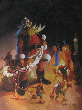
Frazetta's "Tanar of Pellucidar", M.C. Escher's "Relativity", and Dali's "Gala Contemplating...Abraham Lincoln".

This is a fantastic website for lovers of Art & Science, since it comprehensively reveals compositional design concepts with easy-to-understand visuals.  If you want to understand art better, or be a more deliberate designer, check these case studies out ... then apply what you learn.


Russ's Image Analysis Book
Image Analysis

I am a huge fan of John Russ, a retired North Carolina State Professor and image analysis/metallurgist expert.  The analysis methods he often applied to solid state matter are also used to quantify microstructures within soft matter mixtures (i.e. paints and consumer products like cosmetics, toothpaste, and conditioners :) ).  His Image Analysis Processing handbook-6th edition is just being released.  Image Analysis can also be used to analyze Sword & Sorcery cover art to reveal compositional design!  Woo-hoo! 


Shape Analysis of Positive / Negative Space

Let's apply some John Russ's image analysis (employable via the Photoshop interface as "filters") to reveal the composition within the proposed my Lords of Dyscrasia cover art.  I shared a draft of this entry to John and his son Chris (who leads Reindeer Graphics and collaborates with his father authoring books and code), and they rightly clarify that, in artistic terms, the below procedure "is a shape analysis of positive or negative space."

Here is what we'll get:

(1) a skeleton of features within the primary focus, the "Intensity Skeleton"
and (2) a demarcation of the primary "Contrast Interfaces" that lead the viewer's eyes about the image


To do this, we'll apply a series of operations to our color image.
1) First, we'll isolate the intensity levels by transforming the RGB (red, green, blue) image into HSI (hue, saturation, intensity) map; we'll disregard the hue and saturation for this work and focus on the intensity.
2) Next, we'll apply a median filter to remove the high frequency details since we aim to look at the gross composition (a Gaussian blur).
3) Thirdly, we'll transform the grayscale image (256 gray levels) into a binary image (2 levels, black and white) by common thresholding (we choose a critical gray level that turns all lower to black and all higher to white).
4) Finally, we'll fill-in-holes via a morphology filter.
This prework enables us to derive our skeletons. To mark out the features within the primary focus (figures and fire), we...
5) Recolor our binarized image with a Euclidean Distance Map.  This will re-shade all black regions with a new intensity dependent on the proximity to the white area. This effectively will make a landscape in which the peaks (the skeleton) can be isolated
6) To isolate the backbones, we threshold our distance map and select values that contain only the peaks.
7) To visualize the backbone of this internal structure within the focus area, we overlay the skeleton atop a version of the original.


Okay, we are also interested in contrast (contrast mechanisms differentiate the many imaging modes used in microscopy). In common terms we are looking for the edges, or interfaces, between key regions.   
5b) We'll still need our distance map.  We'll go back to image 4 and take a different path. 
6b) This time we'll isolate the edges by thresholding and coloring the opposite peaks (in this case the lightest shades of grey).
7b) We'll overlay them atop a version of the original
8b) And compare these heavy-duty mathematically derived drawings to a simple free-hand estimate (an ellipse).

Hopefully this supports the design I worked in up-front.   The idea was to draw the viewer's eye toward the skeletal hero (the undead, anti-hero Endenken Lysis).


Saturday, February 5, 2011

The Picts and the Lost IX Legion : Realism vs. Sword & Sorcery Representations

  • Who were the Picts? The mystical Picts were iron-age Caledonians, the indigenous people of Scotland. Labeled barbarous, the tribes were never conquered by the Romans; instead, they were eventually isolated by Hadrian's Wall. Picts consistently influence fantasy tales, including many Arthurian legends, Howard's Bran Mak Morn, Arthur Machen's Litte People, and Kuttner's Pikht's of Atlantis. This alone makes their aura sufficient to work with, but my fascination lies with their name since Picti means 'colored people' in Latin. Julius Caeser's documentation (de Bello Gallico ~ 45AD) indicates that the local Picts marked their bodies with vitrum before going to battle, though many think they were painted with woad (a blue dying plant akin to indigo). The Legio_IX_Hispana is a roman legion that mysteriously disappeared ~120 AD.
  • The Pict are appearing in films more frequently, though not in a mystical context:
  1. In 2004, they appeared in the Historical-Fiction-Action movie King Arthur in which Guinevere is portrayed as a Pict (played by Kiera Knightley); I recommend the Director's cut which includes short, but worthy extra scenes fleshing out Arthur's motivations.
  2. The Centurion 2010: This movie explicitly tackles the mystery of the missing IX Legion, and also blames the Picts. Olga Kurylenko
  3. The Eagle (2011): Obviously, I haven't seen this yet, but the trailers indicate a slant toward another pseudo-historical/non-sorcery representation of the Picts. 
  4. Hammer of the Gods (2013): This brutal Viking movie depicts the Picts as cannibalistic.   

Guinevere is a Pict in King Arthur

Centurion Pict

A wild Pict attacks in The Eagle
Vikings are captured & tattooed by Picts in Hammer of the Gods
  • For the mystical “Sorcery” representation of the Picts, you will either:
  1. Need to pick up R.E.Howard's stories (short pulp stories written ~1930 and compiled in 1969) or Karl Wagner’s Legion From the Shadows (1988)
  2. ...or hope that the forthcoming Bran Mak Morn movie actually is produced ...and remains "true" to Howard's depiction
R E Howard's Brank Mak Morn

Wagner's Legion from the Shadows


Frazetta Cover art
  • R.E. Howard's Bran is less famous as Conan, but is a similar hero in many ways. Bran is arguably REH's darkest character, and David Weber did a fine introduction of him in Bran Mak Morn (1969 Bean compilation):
“Of all Robert E. Howard's characters, Bran Mak Morn may be the least known. After all Howard is the author who brought us Conan, Kull the Conqueror, and Solomon Kane. Yet in a sense, Bran and his Picts are more important to Howard's world than any of his characters, including Bran's ancestor Brule. The brooding darkness which clings to virtually all of Howard's heroic fantasy is nowhere stronger than in the case of Bran Mak Morn, last king of the oldest race-an alien among his own degenerating people, set apart by a pure bloodline they no longer share, who knows his entire race is going down into the dark no matter what he does. Yet for all his awareness of the inevitability of the Pict's doom, Bran refuses simply to submit to it. He fights it tooth and nail, as he downs his Roman and Norse enemies. However hopeless his future, all he asks of fate is the chance to meet it on his feet and fighting. ii


•Bran Mak Morn, King of the Picts, assumes epic stature as he is often not the primary protagonist in the tales but a iconic force overseeing the action; in The Dark Man, Bran had been deified in a stone effigy, thus allowing him to participate in the tale and realize the looming warrior-muse that peered over Howard's shoulder and inspired his weird accounts of dark heroes. Below, from the Dark Man, the hero Black Turlough fights to save his beloved Moria from her Viking kidnappers and Howard literally captures his vision of his muse:
And over all towered the Dark Man. To Turlough's shifting glances, caught between the flash of sword and ax, it seemed that the image had grown - expanded - heightened; that it loomed giant-like over the battle; that its head rose into the smoke-filled rafters of the great hall; that it brooded like a dark cloud of death over these insects who cut each other's throats at its feet. Turlough sensed in the lightening sword-play and the slaughter that this was the proper element of the Dark Man. Violence and fury were exuded by him. The raw scent of fresh-spilled blood was good to his nostrils and these yellow-haired corpses that rattled at his feet were sacrifices to him. iii

•If there is any bridge between Howard's work and Lovecraft, it is Bran and his Picts. Lovecraft and Howard had extensive conversations about the Picts and their historic origins. As Bran and his Picts constitute a majority of Howard's 'weird' sword & sorcery landscapes, they resonated with me.  Karl Edward Wagner is worth mentioning here. He constructed a convincing novel length pastiche of Bran Mak Morn called Legions of the Shadows (1976). He was also a well respected horror writer and anthology editor and, like his predecessors, had a fascination with art, which is demonstrated in his Kane story Dark Muse and his short story Sticks (1974). Although I enjoyed the extended insight into Bran Mak Morn's world, I still felt the need to build on the Pict's connection to divine art. 

•I needed to populate Lords of Dyscrasia, and what better civilization to extrapolate from than the Picts, the 'colored' aborigines of the haunted isles of England? There is a subtle reason Picts appeal to me: their evolution in fiction and myth has paralleled that of the artistic dwarf culture. The subterranean and artistic nature of the stereotypical dwarf has always appealed to me. Dwarves are the fantastical representation of demiurges, workers of the chaos of the universe, transmuting the nothingness and divinity of ether in material substance. In Norse tradition, the dwarves of Nidavellir lived in caverns working magical forges. These Norse myths mingled their way into the fairy tradition of the England, in which elves, dwarves, and fairies seem to descend from outcast natives that sought refuge underground. The precise cultural identity of the Picti is quite complicated, and Lovecraft influenced Howard's writing by educating him on the influence of Mongoloid cultures.i


•i Howard, R. E. (2005). Bran Mak Morn The Last King. New York, N.Y., Del Rey Ballantine Books. p327

•ii Howard, R. E. (1996). Introduction, Bran Mak Morn. Riverdale, NY, BAEN. p ix

•iii Howard, R. E. (1931). The Dark Man. Weird Tales, Popular Fiction Publishing


    Saturday, January 22, 2011

    Xmas Card 2010 Bits

    Making Holiday Cards has become an evolving tradition. 
    The sequence of cards are on: http://lindbergcrafts.blogspot.com/


    The composition is in tribute Frank Frazetta's Silver Warrior cover art (Frazetta was a legendary fantasy who passed away this year- 2010; Heidi insisted I remove the sword from Santa's hand...actually she talked me down from doing a "Gift Dealer" rendition of Santa riding Rudolf that mirrored Frazetta's Death Dealer --actually, "Father Christmas" has a history of riding Yule Goats in Scandinavia folktales, so this might be okay for next year's theme).

    I thought I should share a little of my workflow:

    Frank Frazetta's Silver Warrior painting inspired the composition(Frank passed away in 2010)
     

    Initial Sketch of Santa (without sword)
    Photoshop Screenshot revealing excessive layering and masking

    My Final 2010 Cover