Showing posts with label Ken Kelly. Show all posts

Monday, February 1, 2016

Ken Kelly Original - Found by Rathen (Grant Elliot Smith)!

Spawn of Dyscrasia - Original on the move!

Ken Kelly with Grant Elliot Smith
The concept and making of Spawn of Dyscrasia's cover by Ken Kelly is documented in three posts; in short, after springing for the commission and the rights to use it as a cover, I had exhausted my funds. To obtain copy for my house I purchased a signed giclee print in lieu of the original. At that point, I did not know what would become it. 

This month a fellow Sword & Sorcery author, Grant Elliot Smith, reached out to communicate that he had purchased the original from Ken. What an honor! It gratifying on many levels, and it is great to know where the original lives.  It is equally rewarding to connect with like-minded writers, and I'm proud to help with the cover reveal of Grant Smith's adventure due for release in Feb 2016:


Rathen: The Legend of Ghrakus Castle

by Grant Elliot Smith (cover by Matt Stawicki)


Rathen, a former Captain in King Delvant’s army, retired to a quiet backwater town after the Kingdom’s forces were dissolved following the King’s sudden death. Trying to forget his problems by the copious use of strong ale, he is approached by the emissaries of a powerful lord to lead a team of fighters, healers and mages to dispel brigands from his lands. Rathen quickly recruits his best friend, an ex-gladiator and landlord of the local tavern, Bulo, to assist him. The two join other members of the group and begin to hear stories of magical creatures and numerous dead in the land they are supposed to cleanse. Despite this, they head for Ghrakus Castle and on the way they learn of the Castle’s dark and mysterious history.
Finally arriving at Ghrakus, where the full horror of their task becomes clear, they realize that their chances of returning home were indeed very slim and that betrayal awaits him.

Saturday, February 1, 2014

Ken Kelly Cover Art - Spawn of Dyscrasia (3 of 3)

Spawn of Dyscrasia Cover
Spawn of Dyscrasia is due out this year (2014), and this is the last of three posts detailing the evolution of its cover:
  1. Cover Concept (link): The first post covers the goal & concept art
  2. Cover Art (link): The second post chronicles the interactions with master fantasy artist Ken Kelly (from rough sketches to final painting) to yield the key illustration
  3. Cover Design (you are here): This covers the actual design (title placing, masking of the illustration, and overlaid fire).  We have to take the illustration (left) and dress it up for the book (lead design below, on right).

Ken Kelly's portrait reflects a scene from the book and features many important elements that make implicit promises to readers (i.e. expect magic, undead characters); key accessories from the flag to Lysis's sword are accurately presented too.  With that firm foundation in place, we turn to making a cover out of it.  My wife Heidi Lindberg (a trained Interior Designer with a critical eye for all things, and a knack for brutally honest feedback) stepped in to advise on Font & Word placement.  Thanks to her and the folks over in the Sword & Sorcery Group on Goodreads who provided input on some initial compositions (Comp A & B).  Most liked the title being on the bottom (Comp B), and the idea of  the characters standing on a hill of debris resonated with the piece.


Applying some masking layers in Photoshop made (a) the spirit cat easier to see, (b) the edges of the flame more clear, and (c) the rebalancing of the composition (the green flames of the cat tail stretch down into the title to compensate for its "top-heavy" head).  Helen's red-tattoo and the red-blood on Lysis's sword are amplified to match the red in the title and fire.   This is not the final cover design for Spawn of Dyscrasia, but it is fairly close since it covers the below success criteria:
  • Sword & Sorcery:  It promises to deliver "swords/action" and "magic" while revealing a scene from the book
  • Character Focus: The portraiture promises to develop a sorceress and skeletal warrior
  • Internet Appeal: It is easy to recognize as a small icon (as shown via Goodreads or Amazon)
  • Dyscrasia Fiction Look: It continues the look of the first novel, Lords of Dyscrasia (see below side-by-side).  This is important to build the brand of Dyscrasia Fiction.

Small version discernable

Lords and Spawn of Dyscrasia Covers
Consistent with Colors/Composition for Dyscrasia Fiction
Lead Cover Design for Spawn of Dyscrasia (due out in 2014)


Ken Kelly Cover Art - Spawn of Dyscrasia (2 of 3)

Spawn of Dyscrasia Cover
Spawn of Dyscrasia is due out this year, and this is the second in the mini-series describing the cover art, illustrated by master fantasy artist Ken Kelly:
  1. Cover Concept (link)The first post covers the goal & concept art
  2. Cover Art (you are here): This second post chronicles the interactions with master fantasy artist Ken Kelly (from rough sketches to final painting) to yield the key illustration
  3. Cover Design (link) : the last covers the actual design (title placing, masking of the illustration, and overlaid fire)
Ken Kelly - Rogues and Spawn of Dyscrasia

Feedback to First Rough:

The goal was to reapply the composition of Ken Kelly's "Rogues" (that graced the cover of Robert Adam's first Horseclan's novel).  The preceding post (add link) discusses the color selections and design choices.

With this information Ken Kelly set to making some Rough Sketches.  The first featured just Helen, who appeared too zombie-like and her long-nails were accentuated enough but needed to be turned over (to look like she was controlling the fire).  This opportunity allowed me to reinforce that Helen was the living character...and the warrior was the undead one.

Rough Sketches - Spawn of Dyscrasia by Ken Kelly

 Feedback to Second Rough:

I proposed a modified mock-up by placing the Roughs into Powerpoint, and indicated things to tweak (red) and items to keep (blue): 

1.Warrior is undeadà A skeleton…with crown of horns…and fiery aura (cover his biceps, perhaps, since he has no flesh?)
2.He has only 1 sword (his sheath looks like a second)
3.Warriors general stance = cool, no need to change
4.Lady’s stance= cool, no need to change
5.Shadows/lighting = awesome
6.Fire à eventually to be colored with spirits
7.Pennant à I like this shaft… can we add a flag? 

Lastly, Helen needed to be directly connected to the fire, and I wanted to ensure there was one representative Spirit presented within the flames.  Drawing from Ken Kelly's awesome gallery, I lifted one of his great cats (from Feline Warrior), and worked it into another mock-up.  He cautioned that this would throw off the balance of the composition (becoming top heavy).  I agreed, but asked him to work it in anyway; this motivated the "green wisps of ether" special effects to be added later in the Cover Design (post 3 of the series) to compensate.

Ken Kelly - Feline Warrior and Rough Sketch for Spawn

Canvas and Oil Work:

At this point, Ken Kelly began work on a real canvas with his oil paints. I received digital photos periodically:

Ken Kelly - Painting Spawn of Dyscrasia

 The cat turns green and Helen receives a "black-eye."
Ken Kelly - Painting Spawn of Dyscrasia

As the piece approached its end, I had concerns about the bubbles and requested Helen's eye-tattoo to be red, which were easily changed.  Ken Kelly originally titled this "Magic Soldier" but changed it to "Spawn of Dyscrasia" to match the forthcoming book.

Spawn of Dyscrasia - (c) Ken Kelly 2013
Overall, the process consumed a solid nine months. That was partly due to me not specifying a steadfast deadline, taking second-chair to higher priority clients who had real deadlines (i.e. KISS).  Also, given the nature of oil paints, each layer remains wet for some time; so each iteration (paint a layer/get feedback) consumes a few days at best.  Despite this being a commission, our deal was such that he maintained the original.  In addition to the high-resolution photographs created by Ken's photographer, I did order a signed Giclée print (a print on canvas). The last in this blog series captures how the Cover Design incorporated this Cover Art.


Ken Kelly Cover Art - Spawn of Dyscrasia (1 of 3)


Spawn of Dyscrasia Cover
Spawn of Dyscrasia is due out this year (2014), and this three post mini-series describes the cover design process, featuring a custom illustration by master fantasy artist Ken Kelly:
  1. Cover Concept (you are here): This first post covers the goal & concept art
  2. Cover Art (link): The second post chronicles the interactions with master fantasy artist Ken Kelly (from rough sketches to final painting) to yield the key illustration
  3. Cover Design (link) : The last covers the actual design (title placing, masking of the illustration, and overlaid fire)

1) Character Portraits

Whereas its predecessor Lords of Dyscrasia (2011) is a set of narrative tales stressing plot & action with varying points of view, Spawn of Dyscrasia (2014) follows the development of a single character, Seer Helen. The sequel's cover had to embody this new emphasis on characterization, so an appropriate portraiture composition was targeted.  It may seem strange to intentionally pose characters passively on the cover, but there are plenty of precedents. For example, Larry Elmore did this effectively with the original Dragon Lance trilogy (authored by Margaret Weis and Tracy Hickman, including: Dragons of Autumn Twilight, Dragons of Winter Night, and Dragons of Spring Dawning).  Also, Frank Frazetta did this effectively with his Deathdealer character:
Elmore Dragon Lance covers

Frazetta's Death Dealer

These portraits promise books with developed characters...without showing any action.  Ken Kelly has many of these, like his Death's End and Rogue's illustrations (the latter was the cover to the first Horseclan's book by Robert Adams).  In Spawn of Dyscrasia, the character Helen does not develop in isolation; rather she teams with the protagonist from the first book, the skeletal Lord Lysis (who is featured on the cover of Lords of Dyscrasia).  Hence, Ken Kelly's "Rogues" stood out as a good example of what I wanted: a female and male duo portrayed against a fiery scene. 
Ken Kelly Death's End and Rogues

I reached out to Ken Kelly via his website's commission section.  In short, pricing depends on the canvas size and amount of detail; other factors to be arranged are timing and who owns the original.  Here is a snippet from his commission page:
"Fees start at $750. for a single figure, oil painted on 10x14" illustration board with a very simple background.  Fees rise from there depending on what needs to be added and size of original." (copied 2013 from Ken Kelly's commission webpage)
After arranging the commission for two key figures (which prompted a 22"x28" canvas), I sent him the concept art of the two characters to be placed in a similar composition in his Rogues piece.  

Lord Lysis Concept Art

I had drawn Lysis many times already for the illustrated Lords of Dyscrasia, so it was easy to assemble a board to describe his undead state and unique sword, Ferrus Eviscamir.  I also scoured Ken Kelly's vast gallery of oil paintings to identify what Lysis may look like from a painting already made by Ken; Path of Fright worked well for this, since Ken painted some eerie skeletal gargoyles.

Lord Lysis concept board

Ken Kelly's Path of Fright

Helen Concept Art:

Helen had been written about well enough in the draft transcript, but I had never drawn her.  Some internet browsing followed by Photoshopping (namely color inversion) enabled a concept board. Another search of Ken Kelly's library led me to his KISS Girl #5 pencil.  Here Ken's experience painting for the band KISS worked well (he has painted their albums and guitars), since Helen required a tribal tattoo around her left eye.  Helen is not the KISS girl, but referencing her was useful.
 Helen Concept Board

Ken Kelly's KISS Girl

Lighting & Character "Color"

Lastly, a board explained that any fire would simultaneously (a) provide lighting and (b) represent the sorcery that Helen and Lord Lysis command. The magic system in Dyscrasia Fiction motivated the need to have "grayscale" characters: Helen and Lysis can see, feed upon, and cast magic via creative energy (represented by ethereal fire).  Spellcasters are mostly colorless (monochrome); they feed on color, draining it from enemies and sacrificed art, so perform sorcery.
Ether Fire Burning Elder

Monday, October 14, 2013

Imaro - Sword & Soul - Review by S.E.

ImaroImaro by Charles R. Saunders
S.E. Lindberg rating: 5 of 5 stars

Quality Adventure with Legendary Context

Style & Legendary Motivations
This unique blend of Lovecraft & African mythology features a Conan-like hero. It’s pulpy style & storytelling may merit 4 stars: its uniqueness & place in literature boost it to 5.

Imaro is adventure in the vein of vintage, pulp periodicals. Expect heavy doses of sorcery & horror at a brisk pace. Unlike traditional pulp stories, these chapters are slightly less-episodic and more-chronological. In other words, Imaro is more of a continuing character versus Howard’s original Conan publications. Adventure tropes that could be called “cheesy” are compensated well with engrossing, visceral battle scenes and bestial sorcery. In fact, I was reminded of James Silke Frazetta’s Death Dealer series and thought Charles R. Saunders was much more effective at a milieu including jungle/savannah beasts. Saunders’ Imaro felt more Frazetta-like than Gath in Prisoner of the Horned Helmet or Tooth and Claw.

An excerpt from Saunders’s Into to Milton Davis’s Griots: A Sword and Soul Anthology best reveals the author’s passion:
Robert E. Howard and his contemporaries were products of their time. Racism, in the form of white supremacy, was an integral part of the popular culture of the early decades of the twentieth century, and as such it pervaded pulp fiction. As a product of a later time during which the tenets of racism came under vigorous challenge, my enjoyment of fiction from past decades was often compromised by the racial attitudes I encountered in my reading. On some occasions, I simply let it slide. On others, I wrestled with resentment. Then I discovered a way to resolve my dilemma.

Interest in African history and culture surged during the 1960s, and at the same time I was reading sword-and-sorcery and fantasy fiction, I was also absorbing heretofore-unknown information about a continent that was not “dark” as its detractors made it out to be. I realized that this non-stereotypical Africa of history and legend was just as valid a setting for fantasy stories as was the ancient and medieval Europe that served as the common default setting for everything from Conan to Lord of the Rings. A character came into my head then: Imaro, a black man who could stand alongside mythical warrior-heroes like Beowulf and Hercules, as well as fictional creations such as Conan and Kull.
Saunders executed his dream very well, uniquely adding to adventure literature & steering how African mythology is conveyed with entertaining fiction. He coined the term “Sword & Soul” and effectively started a new subgenre. Wow! I would argue that he was so effective at writing that he depicted an almost darker Nyumbani continent (i.e. Africa), albeit one based more on history & substance rather than racism. Saunders’ sensitivity toward enslavement and genocide motivated him to replace his longest chapter (Book 3: Slaves of the Giant Kings) when Nightshade printed the second edition. 

I tracked down this copy too and really liked how Saunder's revisted his past work and made it stronger. The Afua chapter in particular seemed more consistent with Imaro's development as an outcast and his conflict with evil forces...and the writing seemed less forced (especially with Tanisha's introduction). The candid remarks from Saunders and Syzumskyj (a loyal fan who urged him to revist Imaro) added value. In short, despite the first edition being a good-read, I would recommend future readers to grab the Nightshade Version if given the option (since it is even better).

1981 Imaro Edition Contents
• Book 1: Turkhana Knives
• Book 2: The Place of Stones 
• Book 3: Slaves Of The Giant Kings (replaced with “The Afua” in the 2006 edition)
• Book 4: Horror in the Black Hills (Cover for 1986 based from this chapter)
• Book 5: The City of Madness (this is not in the 2006 edition of “Imaro-1” from Nightshade…but does appear in the first chapter in Nightshades’ “Imaro-2” renamed Mji Ya Wzimu its original title in from a 1974 publication in Dark Fantasy...actually, the Nightshade edition offers a different chapter in its place called Betrayal in Blood.)

Imaro
Through these five chapters, Imaro evolves from being a fatherless, abandoned child (desiring to belong to a community)… into a vengeful, tribe-less Hercules-like figure (set on destroying evil forces). An excerpt captures his presence best:
The Illyassai was a fearsome sight. His dark skin glistened sweat-slick through garments that hung in skimpy tatters from his massive frame. Crimson-crusted wounds scored his body like glyphs inscribed by devils. Dried blood matted his wooly hair. His face was hardened into an implacable mask of hatred. Unrequited vengeance flickered like a torch In his eyes, yet beneath the lamina of that emotion lay a core of grief so bitter it threatened to consume him entirely…
Imaro vs. Lovecraftian “Mashataan” Sorcery:
Each story compounds the conflict of Imaro versus the being Mashatann, whose minions or followers assume mythological status:
Elephantine legs rose like wrinkled trees from the ground, Long bony arms hung like sticks from a pair of, knobby shoulders. The hands were incongruously delicate and graceful. Other than his head, those hands were the only remotely human features [spoiler’s name] had left…

…Upon the dais hunched a bizarre image sculpted from pitted, gray-green stone. From the waist up, the creature the sculpture depicted resembled Ngai the gorilla, although its skin was hairless and its wide mouth bore fangs even longer than those of the red panther Imaro had slain. It was the lower extremities of the unknown beast’s body that marked it as something alien to the world of natural beings. Its legs were the hindquarters of Mboa the buffalo: thick, muscular haunches tapering to sharp, lethal hooves.
Cover:
The 1981 cover by Ken Kelly captured the tone, but seems to have some glaring disconnects: the cover depicts Book Four Horror in the Hills, but has a hero that appears non-African and the creature approximates the primary antagonist...but is of the incorrect gender. The NightShade’s edition of Imaro-1, has a beautiful illustration by Vince Evans, but given the color-palette & the lack of magic & creatures, appears to showcase a Historical-Fiction novel rather than Fantasy-Fiction. Perhaps some of those design features were intentional marketing concepts.
Imaro Imaro

Finding A Copy:
The series Imaro continues with 3 more books: Imaro 2 : The Quest for Cush, The Trail of Bohu, Imaro: The Naama War, available from Lulu.com. Mshindo Kuumba has emerged as Saunder’s go-to artist for these. Click here to go to Saunders’ website to locate books: Where to purchase new Saunders books
Imaro 2   The Quest for Cush The Trail of Bohu Imaro  The Naama War (Imaro, #4)
Although the first two Imaro books from DAW were reprinted in ~2006 by Nightshade, they are difficult to find now (2013). Used bookstores are your best bet. Ebooks are being developed according to a very credible source, that being virtual-brother-to-Saunders, Milton Davis, who edited Griots: A Sword and Soul Anthology, the foundational Sword & Soul anthology). He recently commented on the Sword & Sorcery Group on Goodreads - LINK
Milton Davis: Charles's current publisher is working on e-book versions of the Imaro books. There's a new Imaro story in Griots and a new Dossouye story in the upcoming Griots: Sisters of the Spear anthology. And to top it all off, I plan to publish the first book (or two) in a new series by him entitled 'Abengoni.

Sword & Soul is highly recommended to fantasy-fiction readers!


View all my reviews

Tuesday, October 1, 2013

Ken Kelly - Cover Art for Spawn of Dyscrasia

Spawn of Dyscrasia Coverart by Ken Kelly

The sequel to the horror-fantasy novel Lords of Dyscrasia is Spawn of Dyscrasia.  It is on track for a 2014 release.

The commissioned cover art from artist Ken Kelly (Bio) just arrived.  Expect more posts soon documenting the design process.  If you think you are not familiar with his art, browse his gallery Ken Kelly (gallery); you likely have his coverart in your library.

Two draft compositions of the  Spawn of Dyscrasia cover are below.  Thanks go out to my partner in crime, Heidi, who has a flare for fonts & lettering.  She will be tidying the design as the cover develops.

Spawn of Dyscrasia - S.E. Lindberg / Covert Art © Ken Kelly 2013

Spawn of Dyscrasia - S.E. Lindberg - Covert Art by Ken Kelly 2013
COMP A
Spawn of Dyscrasia - S.E. Lindberg - Covert Art © Ken Kelly 2013

Spawn of Dyscrasia - S.E. Lindberg - Covert Art by Ken Kelly 2013
COMP B
Spawn of Dyscrasia - S.E. Lindberg - Covert Art © Ken Kelly 2013

Thursday, August 29, 2013

Ken Kelly - Seasons Greetings

I commissioned Ken Kelly to make the cover art for the sequel to Lords of Dyscrasia, and the painting is due shortly. When the cover art is completed, I will share a blog post chronicling the design.Expect more updates on the sequel soon. The target publishing date is early 2014.

Ken Kelly is a famous fantasy artist who studied under the legendary Frank Frazetta.  Kelly has become a legend himself; browse his oil painting gallery and you will recognize the Horseclan covers, tons of Conan covers, etc.

Of course I have a hobby creating Season Greeting cards (link to S.E.'s card gallery), sometimes with a dark twist...and sometimes with an aim to mimic Frazetta (see 2010 card), but I never approached the darkness Ken Kelly presented so well in "Seasons Greetings".  I have already started this year's card (yes, I know it is only August, but my Fall schedule is busy).  No worries...my card will not be this dark.
  
Season's Greeting - Ken Kelly

Sunday, May 6, 2012

Horseclans 1-4 by Robert Adams - Book Reviews

The Coming of the HorseclansThe Coming of the Horseclans by Franklin Robert Adams
S.E.Lindberg rating: 4 of 5 starsView all his reviews

Fans of military fantasy with Sword & Sorcery traits will enjoy this (David Gemmell and Karl Wagner were better writers, but fans of theirs would enjoy this opener of the Horseclans series). The premise is ostensibly apocalyptic sci-fi, but really it appears as a gritty epic fantasy (i.e. no bullets or lasers or machines, just barbarian hordes, swords and some mutant-telepathy and immortality mixed in).
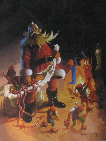
Cover artist Ken Kelly did a superb job, and arguably was more successful than the author in presenting/creating the world. Truthfully, it is worth tracking these out of print books down just for the cover art.  It is an interesting opening book, and since I am compelled to read the next book (Swords of the Horesclans) I rate it 4/5.

Swords of the HorseclansSwords of the Horseclans by Franklin Robert Adams
S.E.Lindberg rating: 3 of 5 stars ; View all his reviews

Epic in scope. A little less gritty than the the first in the series (Coming of the Horseclans), which featured gore, rape, and torture. Instead, the comical plight of Demetrios offers some levity. The logistics of battle are articulated nicely. The dialogue style is unnatural, however; essentially the dialogue is just more narrative from the author rather than genuine conversation. The primary battle is largely anticlimactic since we are constantly made aware that the antagonist army is uninspired and ill-prepared.

I admit to being enthralled by Ken Kelly's cover art. Compared to the text, the cover art disproportionally brings to life the post-apocalyptic North America "Horseclan" world. I am compelled to read the next in the series, though I am expecting less than after reading the first book.


Revenge of the Horseclans (Horseclans, #3)Revenge of the Horseclans by Robert Martin Adams
S.E.Lindberg rating: 4 of 5 starsView all his reviews

Inappropriately named “Revenge” (this nice read had little to do with Horseclans seeking revenge) this introduces the Kindred leader Bili as he assumes power of his clan after his ruling father’s death (the “Bili the Ax” title was reserved for installment#10 but would have made more sense here); again Ken Kelly’s covers seem to represent the book disproportionally… since at least it focuses on Bili and his Axe. This epic fantasy is plagued with some cheesy dialogue, but it is forgivable since the story develops nicely.

This installment continues to develop the Horseclan world at a nice pace while reinforcing the role of telepathy, Kindred Law, and the conflict between: (a) barbarian hordes, vs. (b) sensationalized-greek-religiosity vs. (c) lurking science-derived-warlocks. Bili is set up to have key roles under the Undying god Milo’s leadership.

A Cat of Silvery Hue (Horseclans, #4)A Cat of Silvery Hue by Robert Adams
S.E. Lindberg rating: 3 of 5 stars

This fourth installment continues Robert Adams' dense narrative. The antagonists are portrayed as "Christians turned crazed homosexuals bent on human sacrifice." Bili and Milo continue the quenching of the rebellion (which is still left unresolved...in mid-battle no less).

Disappointingly, the main characters consume the spotlight but do not perform much with their powers other than mindspeak (telepathy). A Cat of Silvery Hue really is about the average Geros, who rises to the occasion to perform heroic deeds that hundreds of nearby veteran warriors fail to address. Geros exhibits more "character" than any of the main characters, and the title is named in honor of his exploits. However, he is a marginal character whose presence is sparse.

I am left with the same feeling I get when I order a greasy hamburger to-go from a fast food joint, leave the drive though, and discover that I was given a chicken sandwich by mistake. I'll curse the restaurant, claim I will never come back, but will anyway after some time.

+ Geros is developed nicely
+ The fight scenes deliver as expected.
+ The Horseclans is very much like fast food.

- The main characters did not develop or perform exciting roles
- All the bad guys are blundering idiots with the exception of Drehkos
- Occasional erotica scenes are out-of-place and laughable
- The Horseclans is very much like fast food.


View all my reviews