Showing posts with label Holiday Cards. Show all posts

Thursday, August 29, 2013

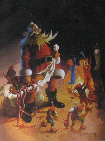
Ken Kelly - Seasons Greetings

I commissioned Ken Kelly to make the cover art for the sequel to Lords of Dyscrasia, and the painting is due shortly. When the cover art is completed, I will share a blog post chronicling the design.Expect more updates on the sequel soon. The target publishing date is early 2014.

Ken Kelly is a famous fantasy artist who studied under the legendary Frank Frazetta.  Kelly has become a legend himself; browse his oil painting gallery and you will recognize the Horseclan covers, tons of Conan covers, etc.

Of course I have a hobby creating Season Greeting cards (link to S.E.'s card gallery), sometimes with a dark twist...and sometimes with an aim to mimic Frazetta (see 2010 card), but I never approached the darkness Ken Kelly presented so well in "Seasons Greetings".  I have already started this year's card (yes, I know it is only August, but my Fall schedule is busy).  No worries...my card will not be this dark.
  
Season's Greeting - Ken Kelly

Saturday, December 8, 2012

Holiday Card 2012


This card wishes all a safe holiday season, and a happy new year that follows. Thanks to Heidi, Erin, and Connor who always support my compulsive card-making behavior.  All previous cards can be found on http://lindbergcrafts.blogspot.com/.  


Fairie Theme

I was obviously inspired by faeries this year.  The connection stemmed from the foundation of many religious celebrations at year's end: the Winter Solstice.  Since the longest night of the year marks the Solstice, it seemed appropriate the have the moon take center stage.  The first concept was to have an evergreen forest decorated with lights.  These lights were to be revealed as faeries migrating from the moon, resting on branches.  Originally they would be carrying lanterns.

The Process

I confess, I started this in September since my Oct. & Nov. schedules were packed.  I was motivated to finish early Nov. to ensure I could get the hardcopies printed in time for an early Dec. publishing.  This process seems to only get more complex each year...ugh.  Anyway, here is how the card was produced:

Initial Sketches

2012blog-12012blog-2
2012blog-3

2012blog-4

2012blog-5

Tweaking the Faerie(s)

During the making of this, the concept of a parade of faeries was reduced to a single one. The remaining faerie took on a glow of her own, so she hardly required a lantern.  She assumed a reflective, praying position (she had to be doing something).  Incidentally, this design change sparked a discussion with our resident mythologist (Erin) who claimed the simplification might still be perceived as odd: she argued everyone knows that angels prayed, but fairies were not known to be religious (as praying would imply).  I agree, but angels and faeries are not far removed from each other on the spectrum of spiritual, winged things.  Besides, if I were a moon  faerie, I would consider coming to earth on the longest night of the year just to look backward, reflect from whence I came, and prepare to tackle the future.  In any event, no offense intended (recall an angel did get center stage in last year's card (link)).

2012blog-7


Winning the Argument

How do you engage a resident mythologist?  Win her over to your way of thinking? Well, you may just up the ante a bit, perhaps incorporate her into the work.  Game on, daughter!  
2012blog-6

3D? 

There is a lot of detail in there, so let's zoom in. Some people see a 3D effect now:  if you first focus on resolve the black silhouette of the treesthen she should appear to float in your peripheral vision (at least on computer screens).  Tell me if this works for you (might be easier to see in the final version at top of this blog).
fairyZoom

Font and Graphics

Heidi helped me with finding a good font.  She found a great one that was easy to read and amplified the moon shape with wondrous circles in the "G","g", and "S".
2012blog-8


Print Prep: RGB to CMYK conversion

Cripes, almost done.  I worked in RGB (Red, Green, Blue) space originally since I am familiar with it and my photos/scans were generated that way (RGB being the format of the raw data from scientific/digital cameras and the display on monitors); however, the printing industry still prefers CMYK (Cyan, Magenta, Yellow, and Key--a.k.a. "black") since those "channels" represent the common ink colors used in printers.  Color transformations are nontrivial, so it is best to work this out yourself rather than rely on some automatic/uncontrolled process if you are going to submit your art for hardcopy printing.

Black (K): Converting in Photoshop appears easy (most try the IMAGE>MODE options), but this doesn't work well (EDIT>CONVERT TO PROFILE allows for more control).  Generally, the RGB colors are converted to CMY_ alright, but the K channel is neglected.  Blacks turn to grays, and the general intensity of the image becomes muted.  To correct this, a program like Illustrator or InDesign is needed (geared toward making actual prints).  I used illustrator to EXPORT my file into a new *.PSD after I had changed the PREFERENCES>APPEARANCE OF BLACK to export RICH BLACK.


(CMY): Then back in Photoshop, to tweak the colors I applied a few ADJUSTMENT layers, I reversibly tweaked the colors "by eye" until they approximated the RGB look.

Tuesday, October 16, 2012

McCrone Group - Micrographia and Holiday Cards

This month (Oct 2012) I had the privilege of touring and speaking at the McCrone Group in Chicago (thanks to Chuck Zona and Kathy Cyr, Hooke College of Applied Sciences Dean and Director of Program Development respectively). Their educational/training branch is aptly named Hooke College in honor of Robert Hooke, the pioneer of mechanics (Hooke's Law) and the "Father of microscopy" (being the author of Micrographia, 1665) .

The visit was an exchange where I discussed "Microrheology of Formulated Consumer Products",  which shares a different perspective on microstructure since their expertise is largely focused on solid, dry particle analysis rather than wet mixtures (lotions, cosmetics, detergents).  Conversely, I was investigating how their services, training, and tools (i.e the McCrone Particle Atlas) could help P&G.

They are setting up a microscope museum and I was able to have a peak at a First Edition, 1665 printing of Micrographia (link is to the interactive online version) being stored in a vault until its case is ready. Don Brooks (CEO) graciously donned white gloves and opened it up for me...even unfolded the "flea" panel. Sweet. As a nerdy microscopist, this was exhilarating. Like looking into the lost ark :) ... but I didn't melt. 

The Group also shares a passion for creating Holiday Cards. Thanks to Christine Gorman (Admissions @ Hooke College) who tracked some of their historic cards down (see below).  I  will have to work microstructure / micrographs into my cards sometime, but not for 2012; this round I stuck to digital painting again.  Keep an eye our for it: this year's theme is faeries.    

All my cards can be found at S E Lindberg - Card Link.  I will again document the design process as I had for the 2011 cherub card.


Historic McCrone Group 

Season's Greetings Cards:

1973: Snowflakes?

Or... Polarized Light of Sodium Bicarbonate?


1988: Christmas Trees?

Or... Rheinburg Illumination of Ammonium Chloride in Water?


1993: Ornamented Pine Boughs?

Or... Fluorescein Crystals?


Monday, November 21, 2011

Holiday Card 2011

A cherub sits atop the earth’s atmosphere, ushering in the new sun with a trumpet call!  Happy new year!
Another year, another card; historic Holidays Cards (from 1998 on) are display here!

Style: Wanted to learn how to paint with PhotoShop (as per artist/microscopist Vince Kamp and ImagineFX workflows (link); Credits: I acknowledge awesome critiques from my wife and daughter; their input was tremendous.  It helps to produce art with a few crafty, artistic folks around (who are not afraid to tell you how to improve).

Here was the process of generating this year’s card:

1) Conception: The initial goal was to incorporate bears into a Holiday theme.  This originated as tribute to our family vacation to the Shenandoah park (having encountered ~5 bears in 3 separate instances).  The only conceivable way of including a bear was as a toy…so the vision of an angel cradling a teddy bear while nestled in pillows emerged…with a morning sun encroaching!  Between sessions at the recent Society of Rheology convention in Cleveland, I  doodled the first composition of a cherub holding a teddy bear.
Society of Rheology Oct 2011 - initial vision of card-2

2) Sketches and Story: When I got home, I used pencil and paper to draw a few cherubs.  The story emerging now was a set of three angels, one awake and hailing the new sun to the annoyance of the other two slumbering cherubs.
IMG_0005IMG_0003IMG_0006

3) Digitization: Next, These sketches were scanned into Photoshop with some pictures of my local West Chester skyline.  Each was granted a dedicated layer and “blocked in” separately with a mask. Wanted to target a Renaissance mood, and experimented with gaudy frames (later eliminated).
3-workflow-composition layers

During SoR we had visited the Cleveland History Museum and its Planetarium; there I learned about the coolest constellation ever, which I tried to incorporate: Microscopium.  This idea was eliminated since the constellation is usually in the South not the East and I required the sun rising behind the angels.
4-workflow- pallette and blocking in

4) Painting: I used a Wacom Bamboo tablet (I can’t rationalize ordering a Cintiq until I learn some more!).  So I began painting over my sketch as if it were a blank coloring book entry.  Using the swatch panel as an artist’s palette works well.  Still need to learn how to use Brush Presets, since I was constantly iterating between masking, painting, dodging/burning/ etc.  Notice how two angels were discarded--one was enough.
  5-workflow swatches as a pallette

5) Adjustment layers: Finally, I added a few adjustment layers to tone down the saturation (i.e. the left image below looked like a neon bar sign) and warmify/cool selected masked regions (to put a translucent brilliance into the clouds); oh yeah, a few carefully placed lens flares helped with the sun’s brilliance. Erin instructed me to turn the eyes from green to blue to match the sky; Heidi had me remove some “mystical smoke” that was blowing from the trumpet…which I thought was cool until I saw her point that it made the angel look like a pipe-smoking crack baby.  Cripes!  A near miss!

6-workflow-merged-layers-v3jpg2011holidayCardHereComesTheSun-v7
6) Final steps! A decorative border and text are added in Illustrator (then tweaked in PS), and woo-hoo! we arrive at the final card (at top)!  Need to order prints from mpix.com !
Saturday, January 22, 2011

Xmas Card 2010 Bits

Making Holiday Cards has become an evolving tradition. 
The sequence of cards are on: http://lindbergcrafts.blogspot.com/


The composition is in tribute Frank Frazetta's Silver Warrior cover art (Frazetta was a legendary fantasy who passed away this year- 2010; Heidi insisted I remove the sword from Santa's hand...actually she talked me down from doing a "Gift Dealer" rendition of Santa riding Rudolf that mirrored Frazetta's Death Dealer --actually, "Father Christmas" has a history of riding Yule Goats in Scandinavia folktales, so this might be okay for next year's theme).

I thought I should share a little of my workflow:

Frank Frazetta's Silver Warrior painting inspired the composition(Frank passed away in 2010)
 

Initial Sketch of Santa (without sword)
Photoshop Screenshot revealing excessive layering and masking

My Final 2010 Cover