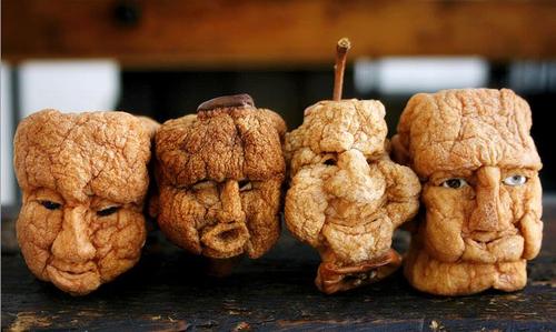
I am designing creatures for the sequel to Lords of Dyscrasia and am exploring possibilities with tangible prototypes. This process yielded an easily reapplied Halloween craft!
Animating Manikins: The dark hero Lysis reanimated the skeletons and armatures of Doctor Grave's Dissection Theater to form his undead troop, the Red Horde(image below). Motivated to integrate the mysterious fruit/orchard themes littering the book (the presence of which will be explained in the sequel) with this Horde led me to literally mix (1) apple-head crafts with (2) art manikins. The results are...
Simple Spooky Apple Head Creatures
Appledolls.org is a nice resource for creating traditional dolls (as seen on Martha Sterwart :)). Below is my modified method:
Skin an apple; for a spooky effect, leave some slivers of skin on the face to mimic scars
Carve into a shape such that, when dried, will resemble a head
Ensure it can be mounted to a doll or art manikin; for the art manikin route, carve a hole in the under side of the apple so that it can become a "helmet"--for a tight fit, allow the apple to dry on the manikin head.
Decorate with paint, needles, toothpicks, etc. ; Simple PVA glue makes for good drool!
The Red Horde: reanimated armatures, skeletons, and art manikins from Lords of Dyscrasia
Just vacationed with the family, the key destination being the natural dye making workshop in Monticello, Virginia (to boost my dye making hobby--Link). After traveling through the Appalachian Mountains and renting a hotel overlooking an abandoned Sanitarium, I began to feel the “Silent Hill” experience.
Although not a proper Sword & Sorcery world, SH allows for an awesome degree of supernatural exploration– a feature once integral to the originating pulps that inspired the genre (Howard, Smith, Lovecraft); the Hill does have the prerequisite elements: ruins, creatures, alchemy (witchcraft). The series sacrifices some action elements to amplify the horror of battling the unknown. It grounds readers in abandoned towns filled with ghosts, only to use that foundation as “reality” to take readers into the next level of horror (“nightmare realm”) in which the cracked paint peels of walls and flies away, and hell (in multiple carnations) overwhelms all. Silent Hill pushes the boundaries of horror in every way, from its character designs, settings, and story.
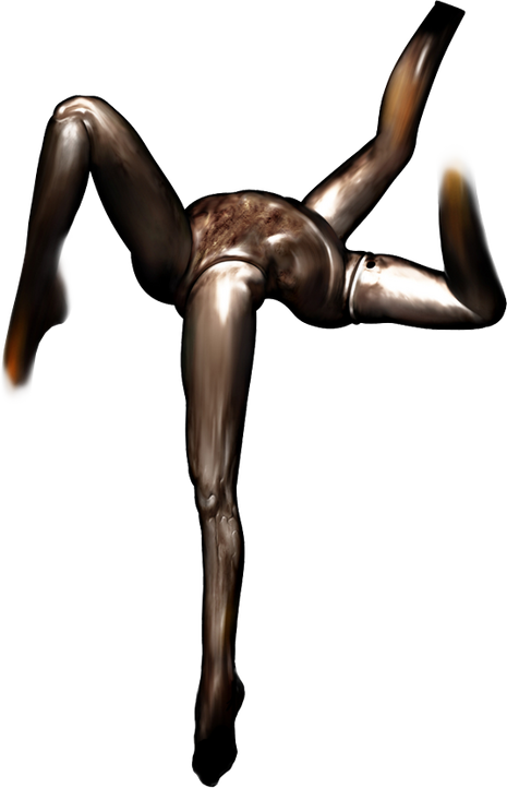
In Silent Hill 1, I was horrified to be chased by knife-wielding dead children in the Midwich Elementary school. But that experience pales in comparison to the debut of Pyramid Head in Silent Hill 2 (room 307 Wood Side’s apartment), in which the butcher-like-demon rapes the four-legged mannequins (that is correct…one torso, four legs). Your character is forced to watched from within a closet—the scene is more bizarre than gory. If Pyramid head or his victims looked more human, than the effect would be lost—that would be too real, less scary. Silent Hill wants you to feel vulnerable and pressured by forces you cannot describe. The fantasy element is crucial. The balance of implicit vs. explicit gore and horror is tough to achieve, but we can learn from masters Like Frazetta (link to earlier post).
Room 307 of Wood Side apartments: Pyramid Head rapes headless mannequins in Silent Hill 2 game–very spooky
The 2006 movie's version town of Silent Hill is located in West Virginia. The town was abandoned after a fire started in the underlying coal mines, much like the real town of Centralia, PA. Basing fantasy from real foundations gives our art credibility; the story way be weird as hell, but will be believable at some level. Suckers like myself cannot stop thinking about the possible truth to ghost stories when they experience settings that evoke the haunts:
The Appalachian Mountains
The below aerial imagery from the Silent Hill movie shows a road in the Appalachian Mountains; in the leading car are a mom (Rose Da Silva) and daughter (Sharon), driving toward the titular town to confront the haunts that plague Sharon’s dreams. A police car follows.
Our recent drive through West Virginia (our images below), sets the stage; map included in case you want to trek over.
Spooky Abandoned Hospital
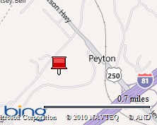
So after hours of driving in the mountains, we stop at a Hotel in Staunton, VA. Staunton is not haunted, but we unexpectedly chose a hotel overlooking a beautiful boarded building (~the intersection of highway 81 and route 250 near the Frontier Museum); From our hotel view (below, looking eastward).
Turns out, it this is an abandoned children’s sanitarium named after the leader Doctor DeJarnette. Due to Doctor DeJarnette’s eugenics project, many inmates were reportedly sterilized in the basement against their will (his butchery and sexual motivations reeks of Pyramid Head). Ghosttowninfo.com - Dejarnette Sanatarium (link) offers interior images and Project Energia Buran offers as a video tour (embedded below)! To be clear, my family did not tour the facility! It is riddled with asbestos and is hardly a family destination. This is not Silent Hill! There is nothing explicitly terrifying about this image; implicitly, it is creepy as hell!
Virtual Tour of the Sanatorium
Project Energia Buran (2007) tours the Sanatorium for us!
Persistent, Amplified Silent Hill Feelings
Every SH game visits a hospital; I think every one has ghost- or living-children running amongst them. Alchemilla Hospital (left image below) and Brookhaven Hospital (right image) are fictional hospitals that are frequently visited in the Silent Hill games. A blog post cannot due these justice…I suggest you get the games and explore them. You will be scared…and you can pretend you are experiencing the haunted (possibly) DeJarnette Sanitarium! Be careful. Once you play the games, you may not be able to stop thinking about the horrors the evoke! Awesome!
#4) Weird, Dark Art Design: Implicit vs. Explicit Gore and Horror (you are here)
____________________ Frazetta's "Warrior with Ball and Chain" --Where is the Gore?
Weird artists have consistently felt misunderstood by the masses, and readily defended their interests as healthy, without evil intent. Just decades ago, renowned fantasy cover artist Frank Frazetta combated the apparent immaturity associated with his art, as he is quoted in his retrospective book Icon:
"They're positive my art my work is bloody and terrible, and I say 'oh Yeah? Find it!' And they can't. There's merely the suggestion of it, a little splash of red on a sword, a spot in the snow, and that's it. I don't paint heads rolling around, or severed limbs... In spite of the subject or violence, I want every painting to be a thing of beauty." (i)
"Sometimes I wonder what people really see when they look at my art. I mean, I know I exaggerate my figures for effect, make them in ways they may not normally move, push things a little to heighten the excitement. And I can get away with the exaggeration and still make you believe in the reality of the scenes because I know how to draw. I know my anatomy. I know how real people and real animals move. But these guys who are trying to 'do' me, boy! Arms and legs the size of trees; blood and guts everywhere, that's not what I do. My figures are muscular, but for chrissake, they're not ridiculous. And despite the violence in my art I want people to look at it and say, 'It's beautiful!' and forget about the situation. I want them to look at it for the sheer beauty and symmetry and the wonderful shapes and color and rhythm, and that's all they will see. They don't think about the fact it's a battle scene. It's taste that separates the men from the boys..." (ii)
Frazetta posed that a portion who admired and attempted to imitate his work did not understand why his designs were effective.
Offer an experience, not a photograph
The effect of horror is best gained when the sensation is most intangible. To put the horror in visible shape, no matter how gibbous or mistily, is to lessen the effect. I paint an ordinary tumble-down farmhouse with the hint of a ghastly face at a window; but this house-this house-needs no such mummery or charlatanry; it exudes an aura of abnormality-that is, to a man sensitive to such impression. (iii)
So wrote R.E. Howard who funneled his views of weird art though his characters, as in the above quote from The House in the Oaks (a story posthumously finished by August Derleth).
Conveying aesthetic events is a key success criteria expressed by many weird artists. Dark fantastical art serves as an experiential map that appeals to the futile hopes of readers who, mindful of the terror but driven by conviction, want to understand the human spirit. Those who think dark art is scary and evil or necessarily gory, those who reprehend it, are merely ignorant. Perhaps those called by dark muses care to endure the terrific process of speculating, researching, and mediating the unknown by reading and writing. Those not willing to experience weird art, but are willing to critic or trivialize it, may just be terrified to explore the human spirit.
Today's mass market genres of fantasy and horror fiction arguably grew from a single 'weird' source nearly a hundred years ago during the depression era; pulp magazines were emerging as a new mass medium, and short stories by authors like H.P. Lovecraft, Clark Ashton Smith, and Robert Ervin Howard carved new boundaries around the realm of fiction. What might interest unfamiliar with weird fiction are the motivations that lured many readers: a desire for answers and the fear of discovering them. Mass market horror and fantasy genres that later evolved from weird fiction are no longer defined by this, for the genres have grown into new territories and audiences that include markets for children, young adults, and consumers insistent on purchasing trilogies. Clark Ashton Smith, weird author, artist, and contemporary of Lovecraft and Howard captured the beauty of the weird tale:
Mr. Lovecraft has stated very lucidly and succinctly the essential value and validity of the horror story as literary art, and there is no need to recapitulate his conclusions. It has often occurred to me that the interest in tales of horror and weirdness is a manifestation of the adventure impulse so thoroughly curbed in most of us by physical circumstances. In particular, it evinces a desire-perhaps a deep-lying spiritual need-to transcend the common limitations of time, space, and matter. It might be argued that this craving is not, as many shallow modernists suppose, a desire to escape from reality, but an impulse to penetrate the verities which lie beneath the surface of things; to grapple with, and to dominate, the awful mysteries of mortal existence. The attitude of those who would reprehend a liking for horror and eeriness and would dismiss it as morbid and unhealthy, is simply ludicrous. The true morbidity, the true unhealthiness, lies on the other side. (iv)
References
i Frazetta, F., Ed. (1998). ICON: A Retrospective. Grass Valley, C.A., Underwood Books. p98
iii Frazetta, F., Ed. (1998). ICON: A Retrospective. Grass Valley, C.A., Underwood Books. p158
iii Howard, R. E. (2001). The House In The Oaks, Nameless Cults. Oakland, CA, Chaosium Publications. P168.
iv Machen, A. (1973). Planets and Dimensions: Collected Essays of Clark Ashton Smith, Mirage Press
An interactive map explorer on S E Lindberg.com allows you to correlate the events, characters, and geographies of Lords of Dyscrasia. The Flash widget was originally designed to explore conventional maps of cities, but was easily adapted for the Land and Underworld of Lords of Dyscrasia; a magnifier and navigation bars allow for easy zooming and panning; the flashing dots are locations with pop-up descriptions and images--> just click on these to show a pop-up image and description.
Another Flash widget enables the Dyscrasia Museum browser: Once there, just click on the square "Folder" icons and get a pop-up of images and details for each character:
To HTML5 radicals (Flash-nay-sayers?), please note that the text content andimagesare (1) searchable by search engines and (2) easy-to-update outside of Flashsince all content is external to the SWF file and is referenced via a simple XML file. The process is easy: locate a SWF interface you like from online markets, spend ~$5 - $15 for a royalty-free version (generally), and update the XML text and supply your images. You'll get a cool web interface with little coding. If desired, most widgets come with the original Flash files, so you can custom them if needed (and you own Flash); otherwise, most can just insert the SWF widget into their HTML, WIKI site, etc.
Interview with fellow microscopist/illustrator, Vince Kamp
I begin with a call-out to the world-renowned microscope stage developers: Linkam Scientific. Many industries require the ability to accurately perturb material or biological specimens with temperature, shear, tensile stress, exposure to radiation, humidity, etc.; and the Linkam crew enables viewing of microstructure via optical microscopy and many spectroscopic methods while doing so. Rheologists and biologists alike adore their fine craftsmanship. Linkam's products are available in the U.S. from many dealers including the McCrone Research Center (Walter McCrone was a famous "chemical microscopist" responsible for analyzing the pigments within the Shroud of Turin). Check out the Linkam online TV channel for more:
Turns out, although I have been interacting with Linkam since the late 90's, I did not know until recently that Operations Director Vince Kamp has been churning away on his own illustrated children's book. I was delighted to learn that he has a similar workflow: (1) sketch by hand onto paper, (2) scan, (3) color/texturize digitally. His style is natural; it looks naturally painted with oil paints. So here goes my informal interview with him:
SEL:Vince, how do you construct your paintings? VK: As far as my process is concerned, well I sketch everything in pencil and then scan and import into PS. I block in background colour and then block in my characters, I work from dark to light and use only one brush, a sort of splatter brush that mimics a traditional brush, set to 90% opacity and use pressure sensitivity on my tablet (wacom cintiq, 12") [SEL: Cripes! I want one of those!]. I have messed around with water based colouring pencils and oil pastels but not for my online stuff.
Side bar: This mixed media approach of (1) sketching, (2) scaning, (3) digitally coloring is getting popular.
So here goes another call out to the friendly Brits. They have an entire professional magazine dedicated to like artists; and it's rooted in fnatasy and sci-fi art. Check out the ImagineFX website (their magazines are distributed in Barnes & Noble too).
SEL:You are too humble for words, and your sarcasm is thick...but delivery dry (especially via email). Please clarify how you get your digital colors to look like real paint.
VK: I'm heavily influenced by traditional painting techniques and though I'm completely untrained and don't know what I'm doing [SEL: UK humor?], the books I study almost exclusively focus on light and colour in oil painting. So I guess I'm saying my pics may not look so digital because I try to paint in a traditional way of using layers of paint and blending. I almost never use all the various tweaking filters in PS as I would love to one day have the time to paint properly on canvas. I don't want to rely on digital tools to get the look I want. If I ever get round to being able to create a beautiful oil painting I think I would feel like I could really exploit everything in PS to produce much better pictures, but I would like to earn that right by studying all the fundamentals first. Understanding colour and light is just so fascinating and I don't believe I've even scratched the surface, it's insanely frustrating.
SEL: Your style is perfect for a kid's book, I can't wait to see how Leo the Robot Slayer emerges. Does any work inspire this style?
VK: Even though my pics are all cartooney I love Vermeer and Rembrandt and many of the more obscure post renaissance painters from in and around my Dad's village in Holland. I know I'm waffling but I thought I would give you an idea of how I think when I'm colouring my pics as the process itself is really very simple. One brush, 90% opacity. If you haven't already, check out James Gurney's light and color http://www.amazon.co.uk/Color-Light-Guide-Realist-Painter/dp/0740797719. By the way, the comment that my pictures don't look digital is probably the greatest compliment I have received so far, as that is ultimately what I'm desperately trying to achieve.
Evokes Memories of Awe from Dark Crystal Experience
Creatures are a key element of Fantasy works. They are usually represented on a colossal scale (dragons, the Star Wars Rancor, etc.) or on a humanoid scale (like the mythogical Minotaur...or the orc armies of Tolkien's Middle Earth). To be surprising and scary, creators of new monsters are motivated to be unique (familiar creatures inherently have lost their sense of strangeness that makes them fantastical in the first place). Creating novel things becomes increasingly difficult as the historic pool of creatures accumulates; this May, I was inspired to see how the Cirque du Soleil reinvented their offerings with "Ovo", a theatrical fantasy based on an imaginary insect world whose unique richness stems from its character/creature design (this was my first experience, though it is the 25th show design in as many years for the Montreal based entertainment group).
Ovo Cricket Costume
It seems Cirque du Soleil needed a new excuse to allow their talented performers to show off, and they hit the mark really well. All the designs meshed as an integrated world: the sets, the costumes, the choreography, music...somehow the entire event appeared as one place. Designing costumes that not only look insectan, but allow performers to perform athletic feats without distraction had to be challenging for designer Liz Vandal.
Was there a story? Not really...though it wasn't needed. The performance was entirely eye-candy. Was there conflict? Almost no conflict existed in the storyline, with some minor comedy coming from the Foreigner character trying to woo the Ladybug (of course, there was the ever present man-vs-nature conflict with the contortionists, acrobats, etc. continually snubbing their noses at gravity and muscle contractions). Except for a few moments that I cannot explain....
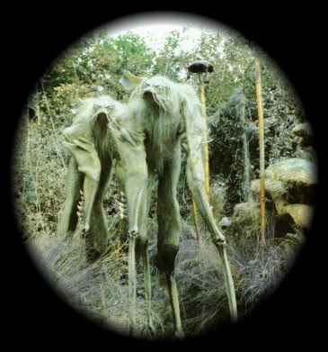
A Fleeting Battle Brought Mysterious Conflict!
Mysterious walking sticks brought tension to the stage. These stilt walking bad guys tried to approach the Foreigner, but the Ladybug fought them off. Were these Walking Sticks? Or Jim Hensen's Landstriders? I cannot identify these creatures by name since they were not represented in the program or online (by deduction, they were not "fleas", "roaches", or"mosquitoes"). I share a snapshot of the Official OVO Program booklet since I was unable to locate an image online to reference. To highlight the Walking Sticks I desaturated the surrounding set (below image).
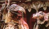
These instantly evoked the awesome "Land Striders" from the 1982 Dark CrystalMovie. Of course, the Land Striders were literally big puppets, powered by stilt-walking puppeteers...though I recall them being the "good" type of creature.
Dark Crystal Land Striders
Ovo - Walking Sticks?
Dark Crystal Sequel Brewing
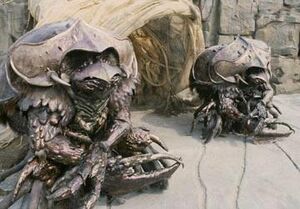
Dark Crystal Skeksis
Now I remember...the Land Striders were largely dismembered by the evil Garthim beetles (allies of the bird-like Skeksis). Looking for inspiration on designing creatures? I recommend procuring the The Dark Crystal (25th Anniversary Edition) which provides featurettes revealing behind-the-scenes designs, including commentary by the Dark Crystal's conceptual designer, the acclaimed Fairy artist Brian Froud.
Froud has a distinctive style that seems to bring real-life to his fairies--even take life away to preserve their real-forms...as in Lady Cottington's Pressed Fairy Book : 10 3/4 Anniversary Edition; In addition to sketches, the book was designed to preserve (to a squished degree) real fairies.
Froud's Pressed Fairy
Froud's Fairy
It is interesting that even in 1982 (before ATM's and microwave ovens really hit their strides...let alone computers as we know them), Jim Hensen was inspired to bring "life" to the movies that the new band-wagon of special effects could not (Star Wars was rocking the movie world then). Over three decades later, there is still a reliance on technologies that do not necessarily impart a sense of real-life in our characters. The Dark Crystal's Garthim beetles were as real as the Scarabs in the live performance of Ovo, and arguable more real-feeling than many of today's digitized creatures. The challenge for artists is figuring out how to really animate our fantasy characters with pen and paper (Ovo has done it for the stage).
Well, like many other promising movies in the 2011 Sword and Sorcery film queue, there is a sequel brewing that may reinvigorate the awe of the Dark Crystal for another generation (see below links).
This is a fantastic website for lovers of Art & Science, since it comprehensively reveals compositional design concepts with easy-to-understand visuals. If you want to understand art better, or be a more deliberate designer, check these case studies out ... then apply what you learn.
I am a huge fan of John Russ, a retired North Carolina State Professor and image analysis/metallurgist expert. The analysis methods he often applied to solid state matter are also used to quantify microstructures within soft matter mixtures (i.e. paints and consumer products like cosmetics, toothpaste, and conditioners :) ). His Image Analysis Processing handbook-6th edition is just being released. Image Analysis can also be used to analyze Sword & Sorcery cover art to reveal compositional design! Woo-hoo!
Shape Analysis of Positive / Negative Space
Let's apply some John Russ's image analysis (employable via the Photoshop interface as "filters") to reveal the composition within the proposed my Lords of Dyscrasia cover art. I shared a draft of this entry to John and his son Chris (who leads Reindeer Graphics and collaborates with his father authoring books and code), and they rightly clarify that, in artistic terms, the below procedure "is a shape analysis of positive or negative space."
Here is what we'll get:
(1) a skeleton of features within the primary focus, the "Intensity Skeleton"
and (2) a demarcation of the primary "Contrast Interfaces" that lead the viewer's eyes about the image
To do this, we'll apply a series of operations to our color image.
1) First, we'll isolate the intensity levels by transforming the RGB (red, green, blue) image into HSI (hue, saturation, intensity) map; we'll disregard the hue and saturation for this work and focus on the intensity.
2) Next, we'll apply a median filter to remove the high frequency details since we aim to look at the gross composition (a Gaussian blur).
3) Thirdly, we'll transform the grayscale image (256 gray levels) into a binary image (2 levels, black and white) by common thresholding (we choose a critical gray level that turns all lower to black and all higher to white).
4) Finally, we'll fill-in-holes via a morphology filter.
This prework enables us to derive our skeletons. To mark out the features within the primary focus (figures and fire), we...
5) Recolor our binarized image with a Euclidean Distance Map. This will re-shade all black regions with a new intensity dependent on the proximity to the white area. This effectively will make a landscape in which the peaks (the skeleton) can be isolated
6) To isolate the backbones, we threshold our distance map and select values that contain only the peaks.
7) To visualize the backbone of this internal structure within the focus area, we overlay the skeleton atop a version of the original.
5b) We'll still need our distance map. We'll go back to image 4 and take a different path.
6b) This time we'll isolate the edges by thresholding and coloring the opposite peaks (in this case the lightest shades of grey).
7b) We'll overlay them atop a version of the original
8b) And compare these heavy-duty mathematically derived drawings to a simple free-hand estimate (an ellipse).
Hopefully this supports the design I worked in up-front. The idea was to draw the viewer's eye toward the skeletal hero (the undead, anti-hero Endenken Lysis).
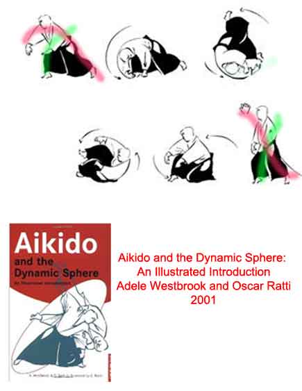
Could I become a better artist by being thrown around like a sock puppet? Newby Aikido students (myself included) quickly gain a new perspective of anatomy as they attempt to "roll properly"...only to flounder like a fish-out-of-water. Being more aware of posing, posture, and balance is allowing me (to my surprise and delight) to enhance my approach toward composing figures.
In Cincinnati there is an local interest in Aikido, a martial art that focuses on rolling, momentum balances, and defense rather than stereotypical punching and kicking. At the World Fantasy Convention 36 in Columbus this past Oct. I introduced myself to a local fantasy writer Stephen Leigh Farrell (author of The Nessantico Cycle and The Cloud Mages Trilogy) -- a coworker teaches Aikido with him so I had a story to introduce myself. Stephen was clearly as enthusiastic about "throwing" people as much as he was encouraging them to write. Turns out, another co-worker/friend of mine teaches Aikido so I signed up and am being thrown on a weekly basis now ("I am so a white belt" as my niece once said proudly about her own martial art expertise).
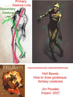
I am far from being an Aikido expert, but a key to "proper rolling" seems to be considering your body a set of axes (a "x") such that you can roll across one of them (thus limiting damage to your spine and transferring momentum across your body). Below I illustrate this by sharing an image from the oft-reference book of Westbrook and Ratti called Aikido and the Dynamic Sphere, an illustrated introduction: I draw over the image of a man rolling with primary and secondary axes indicated.
This "primary and secondary axis" approach toward understanding and composing figures is nicely explained by Jim Pavelec (fantasy illustrator and author of Hell Beasts, a guide for drawing evil creatures). I met him also this October in Columbus at theWorld Fantasy Convention 36 . In his Hell Beasts book he details "Gesture" as:
"Gesture, or the overall movement and pose of a figure, is the foundation of any good composition, giving your drawings the fluidity and force necessary to capture the viewer's eye. You can set the mood for an entire piece by first laying out a simple gesture drawing consisting of only a few lines...There are two types of gesture lines: primary and secondary. The primary gesture line is the fluid mark that runs along the figure's centerline. For example, when looking at the humanoid figure from the front, the primary gesture line goes from the head, through the center abdomen, then to the pelvis, where it sifts into either the action leg or the weight-bearing leg....Secondary gesture lines,or rythym lines, are lines that flow through the form connecting secondary body parts such as limbs, tails, wings, and tentacles..." p14
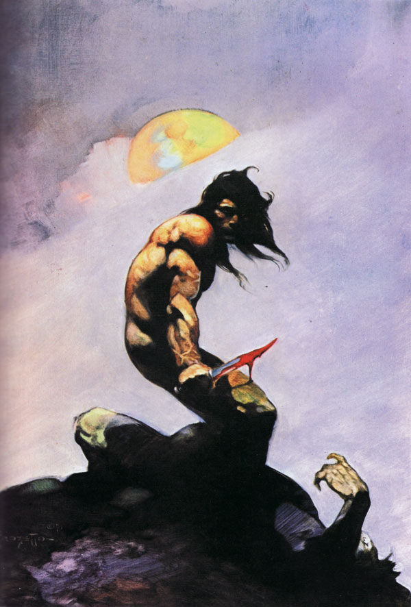
The composition is in tribute Frank Frazetta's Silver
Warrior cover art (Frazetta was a legendary fantasy who passed away this
year- 2010; Heidi insisted I remove the sword from Santa's hand...actually she talked
me down from doing a "Gift Dealer" rendition of Santa riding Rudolf
that mirrored Frazetta's Death Dealer --actually, "Father
Christmas" has a history of riding Yule Goats in Scandinavia folktales, so
this might be okay for next year's theme).
I thought I should share a little of my workflow:
Frank Frazetta's Silver Warrior painting inspired the composition
(Frank passed away in 2010)
Initial Sketch of Santa (without sword)
Photoshop Screenshot revealing excessive layering and masking


